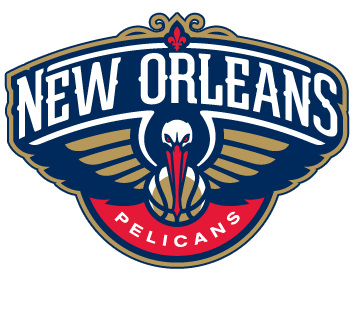
There's just no sense of identity in this. Here's a pretty smart post by SB Nation blogger Andrew Sharp.
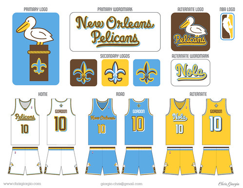
The whole reason we loved the Pelicans name was the brilliance of having a team named the Pelicans next to teams like the WOLVES and THUNDER and GRIZZLIES. The Pelicans were just ridiculous and lovable enough to be perfect for a pro basketball team in New Orleans. And now they're trying to get tough and serious-looking all of a sudden?Sharp even references my favorite of the many many proposed amateur designs.

That's a design by Chris Giorgio. He later re-worked it a bit when we learned what the colors were going to be. I like that version too but his original is better. It would have become an instantly distinguished brand. If city's team should be willing to embrace something offbeat, it's New Orleans's team, right?
Sharp adds:
Look at that New Orleans Pelican! That's the goofy ass Pelican we wanted all along. That's an ABA Pelican right there. What we have now is something like an XFL Pelican, menacing us with its evil glare, pretending to be ruthless, pretending that sports are serious. It sort of undermines the entire idea of naming a team the Pelicans, right?I couldn't agree more. But oh well, if you're ready to go crazy buying your $39.00 New Orleans Pelicans hats you're gonna have to deal with the Atlanta Hawks knock-off for now.
Or for about half that you could go with one from NOLA Brewing which looks pretty much the same anyway.
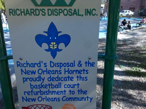
Finally, since we've managed to contort another Fleur-de-lis out of this design

I'm wondering how long it will be before they send a guy out to adjust the signage at the recently dedicated Laurence Square basketball court.

No comments:
Post a Comment